Apr 23, 2024
Looker Studio vs. Power BI for data visualization
7-MINUTE READ | By Milja Nevalainen & Joy Huynh
[ Updated Apr 23, 2024 ]
When it comes to data visualization, Looker Studio and Power BI both have their own strengths and weaknesses. Rather than pitting them against each other and deciding which tool deserves the crown, it’s better to understand which one works best for what scenarios.
In this article, we’ll review Looker Studio vs. Power BI and help you make an informed decision. The criteria are:
Looker Studio vs. Power BI: Ease of use
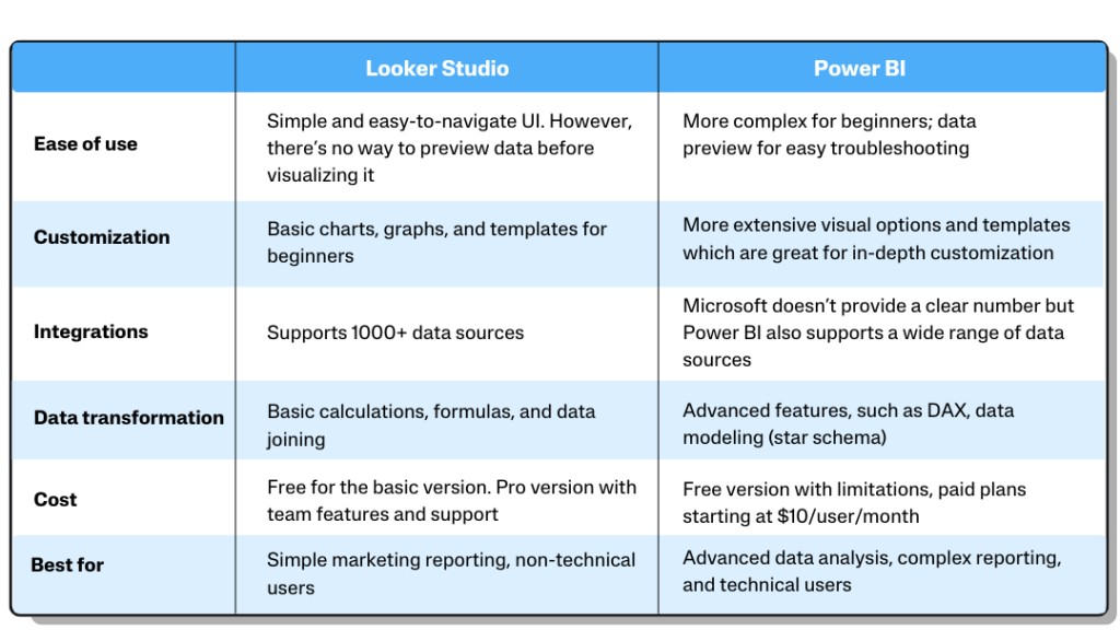
If you have a data analysis and programming background, Power BI may feel more intuitive. On the other hand, if you have basic data visualization skills, Looker Studio works wonders.
How easy is it to use Looker Studio?
Looker Studio has a simple interface with a drag-and-drop editing sidebar, which makes it easy to add data sources, create charts, and build reports. It’s very user-friendly.
From our team’s experience, customizing your reports in Looker Studio is easier and more intuitive. This is because it has a simpler layout and fewer options than Power BI. It’s faster to find what you need. For example, if you want to change the background color, you can easily find that option on the design panel on the right side of your screen.
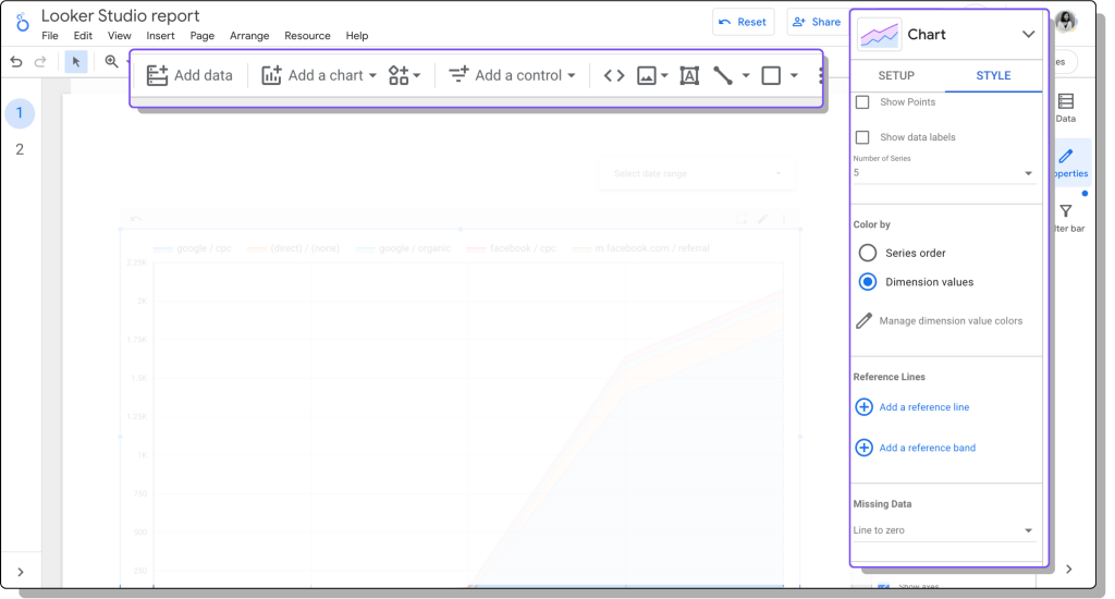
Additionally, Looker Studio is great for collaborating with your teammates. You can easily share the access and let others work on your dashboard simultaneously. It’s easy to adjust the level of access—view-only or edit.
Because Looker Studio doesn’t show a preview of your data—how your data is structured and formatted— before visualizing it, it can be difficult to inspect errors and troubleshoot, especially when you work with multiple data sources. If you want more control over your data, we recommend you crunch your numbers in Google Sheets. Once you’re happy with the results, you can feed them into Looker Studio.
How easy is it to use Power BI?
We’ve noticed that working with Power BI feels natural and intuitive for those with data analysis and manipulation skills. It shows a preview of your data, which makes it easy to spot errors and troubleshoot.
What our team likes (and doesn’t like) when building a dashboard in Power BI is the endless customization options. It’s great that you have more control over the look and feel of your reports. But, at the same time, it can easily get overwhelming, especially for beginners, just by scrolling through all the design panels.
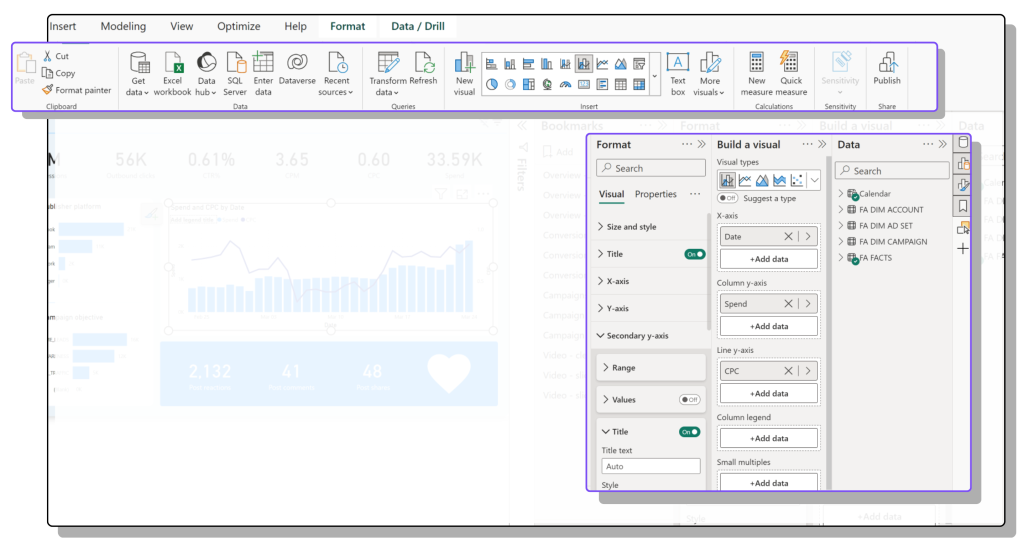
Additionally, you’ll notice some differences between the desktop and cloud versions of Power BI. We find that the cloud offers fewer functions and features than the desktop version. That’s why we primarily used Power PI Desktop to build and edit reports and then publish them to the cloud workspace so stakeholders can access them.
Looker Studio vs. Power BI: Customization
Both Looker Studio and Power BI have various customization options—basic charts and graphs, custom visuals, and templates— that allow you to build the reports you need. However, Looker Studio works better for simple visualizations. On the other hand, if you need in-depth customization for highly specific reporting requirements, Power BI is the better choice.
How can you customize your Looker Studio dashboard?
When customizing your reports, you’ll find many basic charts and graphs in your Looker Studio dashboard. You can also apply different themes and layouts to your dashboard to make them look on-brand.
If you want to go beyond the default visuals in Looker Studio, you can find more advanced charts from the visualization community. For example, you can check out Supermetrics Charts and discover new charts that could help you enhance data storytelling in Looker Studio.
Beginner users who have just started building dashboards can browse through the report gallery and swipe a free template. Another great resource for pre-made reporting templates is the Supermetrics marketing template gallery.
How can you customize your Power BI dashboard?
Similar to Looker Studio, you’ll also find the basic charts and graphs—scorecards, time series, bars, maps, etc.— in Power BI. You can also apply different themes and layouts to your dashboards.
In addition to the standard charts and graphs, Microsoft recently invested heavily in custom visuals in Power BI through AppSource. This opens a door of possibilities for users who want to elevate their reports and storytelling.
Looker Studio vs. Power BI: Integrations
Both Looker Studio and Power BI support connections to various data sources, whether through native connectors or third-party connectors.
What data can you bring into Looker Studio?
In Looker Studio and Power BI, data sources or connectors allow you to fetch data from different platforms. Using Looker Studio, you can import data from Google-supported platforms—Google Sheets, BigQuery, Google Analytics, Google Ads, etc.—for free to your dashboards. If you want to get data from external sources, you can use third-party connectors. Looker Studio has a partner connectors community that supports over 1000 data sources.
What data can you bring into Power BI?
There are many ways you can bring marketing data into Power BI. It supports direct connectivity to numerous data sources, including Microsoft products like Azure SQL Database and Excel. Additionally, it connects to many third-party databases and online services. Power BI’s ecosystem includes hundreds of third-party connectors.
Looker Studio vs. Power BI: Data transformation
Looker Studio works well for basic data manipulation, such as simple calculations and formulas.
Power BI is perfect for data analysts and BI professionals who want a scalable and sustainable data analytics solution that works with the Microsoft ecosystem. It offers advanced data blending features and deep filtering techniques that can be layered onto basic spreadsheets.
How can I transform data in Looker Studio?
Looker Studio is great if you only want to look at impressions, clicks, and CTRs of a single channel.
For combining data from multiple sources, Looker Studio has data blending features that allow you to blend up to five data sources.
However, data blending in Looker Studio has some limitations. For example:
- You don’t have visibility into what’s happening under the hood
- Slow Looker Studio reports if you’re joining data directly from the sources without storing it in a marketing data warehouse or storage
- You can’t blend more than five data sources at once
- It doesn’t support UNION
To overcome data blending problems in Looker Studio, it’s better to blend your data in either Google Sheets or the Supermetrics Marketing Intelligence Cloud.
Additional resources: Data blending in Looker Studio and how to overcome its limitations using Google Sheets and Supermetrics
How can I transform data in Power BI?
Compared to Looker Studio, Power BI has more advanced and powerful data transformation features. One feature that we love is data analysis expressions (DAX), which allows users to create new data tables and complex calculations.
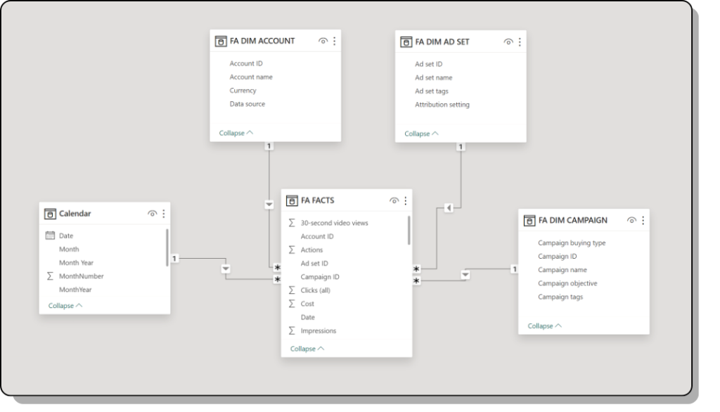
Additionally, you can work with data structure and modeling in Power BI. For example, you can use a star schema to manage and organize data.
We’d say you need to understand data modeling and know what you’re doing with your data to fully take advantage of Power BI. Working with DAX or star schema aren’t exactly marketer-friendly. That’s why, for teams using Power BI, we typically see they have a data team managing the data and the underlying work so their marketing team can build reports.
Looker Studio vs. Power BI: Cost
Both Looker Studio and Power BI have a free version with some basic reporting features and a paid version with more advanced features and support. Depending on the data you want to pull, you need to pay for third-party connectors.
How much does Looker Studio cost?
The basic version of Looker Studio is free — making it accessible to small businesses. Looker Studio also has a pro version that offers team workspaces (with more granular access control) and enterprise-level customer support via Google Cloud Customer Care. Additionally, if you’re using third-party data connectors to get data into Looker Studio, you also have to pay. For example, a Supermetrics license for Looker Studio starts from $39 /€39.
Read more about Looker Studio pricing.
How much does Power BI cost?
While a free Power BI version exists with data connectivity for simple datasets, report sharing, collaboration, and more advanced features, it requires a paid subscription starting at $10 per user/month. Like Looker Studio, you’ll have to pay to fetch data through a third-party connector. For example, a Supermetrics license for Power BI starts from $69/€69.
How companies are using Looker Studio and Power BI
Radio-Canada uses Looker Studio to share campaign insights across the organization
Radio-Canada is the most prestigious public broadcaster in Canada. It’s using Looker Studio to build marketing reports and share them across the entire organization. By combining data from multiple sources in a dashboard, the team gains insights into campaign performance and audience interest.
Christophe Cluzel, Senior Director of Marketing Communications, explains, “Looker Studio is helpful. We can use visualization to help non-technical audiences understand the data.” Since Looker Studio is easy to use, other teams within Radio-Canada, such as business intelligence, revenue, and search teams, also build reports and optimize campaigns. This way, everyone has access to the reports and data they need.
Additional resources: How Radio-Canada gains insights into their audience’s interests and maximizes budgets with Supermetrics, Looker Studio, and Excel.
Save the Children uses Power BI to achieve master data management
At Save the Children, master data management means centralizing their reporting function to operate as a self-service business function. They achieve this by using the Supermetrics API to feed all their data from all their third-party platforms into Power BI.
Previously, they used spreadsheets and Looker Studio, but this became unmanageable as data grew. That’s why they switched to Power BI. It gives advanced data analysis functionalities that were missing in their previous solution.
Additional resources: How Save the Children UK saved +£10k/year by smart data management powered by Supermetrics and Power BI.
The final verdict
Looker Studio is the way to go if you mainly deal with simple and basic marketing reporting and you’re looking for an easy-to-use data visualization tool. On the other hand, if you’re a technical marketer who loves to dive deeper into data structures and modeling, Power BI is a better fit.
We also see many teams getting the best of both worlds by using Looker Studio for quick ad-hoc reporting and Power BI for more complex internal reporting.
The tool you choose depends on many factors, including data skills and knowledge, reporting needs, and company policies. We hope what we’ve discussed throughout this article helps you understand both tools and make the right decisions.
About the author

Milja Nevalainen
Milja is a Data Analytics Consultant at Supermetrics. With her in-depth marketing analytics and dashboarding knowledge, she's helping Supermetrics clients build impactful dashboards in Looker Studio and Power BI. Besides, she hosts multiple training sessions and webinars to help our audience learn how to use data to improve their performance. Before Supermetrics, Milja honed her skills in the biggest agencies, for example, GroupM Finland and OMD, where she was involved in strategic online media planning, project management of online ad campaigns, and account management across various markets in Europe and the Middle East. She's proficient in conducting competitive analysis, audience segmentation, and campaign evaluation using analytical tools such as Netbase, Tubular, TGI, GWI, and Brandindex.
Joy Huynh
Joy is the Content Strategist at Supermetrics. She's working with writers and subject matter experts to create marketing data content that's helpful and fun to read.
Turn your marketing data into opportunity
We streamline your marketing data so you can focus on the insights.